US health care efficiency did not go off the rails until about 30 years ago.
Wednesday, July 13, 2011 at 01:49PM
Skeptic in Health Care

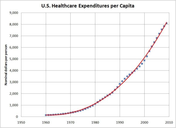
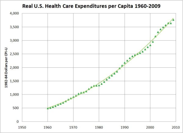
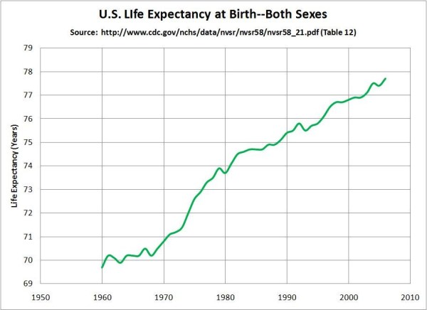
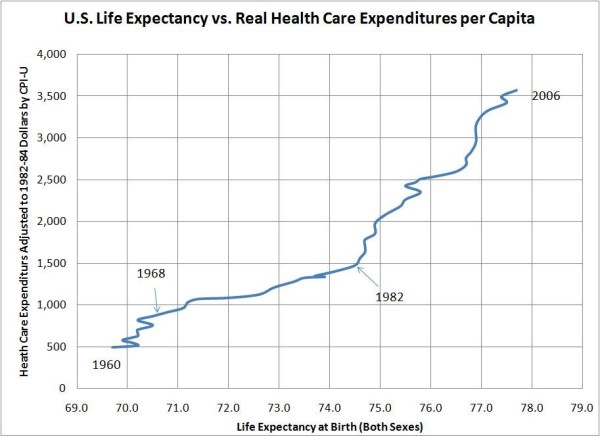
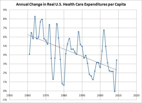
The US has the lowest life expectancy of any of the 20 richest nations and vastly higher per-capita healthcare costs. Okay, I think we knew that, but we didn't know until Lane Kenworthy did the analysis and posted the following chart on his blog that something(s) happened in the early 1980s that resulted in our going from just being one of the worst performers in this group to being a radical high-cost, short-lives outlier.

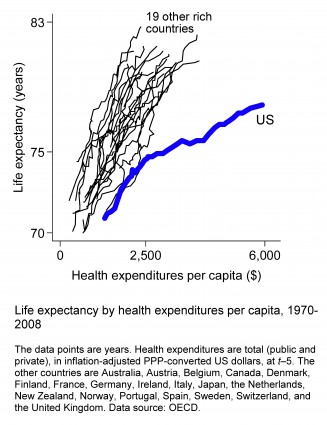
(Dollar figures are indexed to 2005. Life expectancies are at birth.)

Looking at the black lines representing the other 19 nations, they all have about the same slope of increasing life expectancy vs. increasing expenditures. Until the early 1980s, the US trend line was on that same slope, but then we alone veered off into a zone of radically increasing costs without achieving any improvement in our near-the-bottom life expectancy ranking in this group of 20. Of course, this graph does not tell us what caused the divergence, but it does point to a time period that should get our attention. What US policy changes, or market changes that affected only the US, were occurring then and continuing?

My top targets for investigation would be out-patient care and administration. Kenworthy's post links to some good sources, especially this September 30, 2009 OECD report to Congress. Chart 8 there compares healthcare spending by category (out-patient, in-patient, drugs, etc.) among the US, Canada, France, Germany, and Japan.

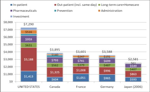
Note that in all seven categories, the US spends more than any of the others, but what stands out the most is that the US spends 2.4 times as much as the second-place nation on out-patient care and 2.1 times as much on administration. If both of these categories had been only at the levels of the second-place nations, US healthcare spending would have been $2,132 per-capita (29%) less than it actually was in 2007. In-patient care costs alone would have been $1,863 lower. Together these two categories were 53% of 2007 US healthcare spending.

One possible explanation for the divergence in the first chart above is that when wages and salaries for middle-income Americans started being limited to the inflation rate in about 1973, incomes of US healthcare providers kept rising faster than inflation. If that happened, it might well be because the US healthcare sector has been very effective, politically and/or otherwise, in protecting its incomes from the general stagnation of real personal incomes. If that's what happened, and if the incomes of the healthcare sector in the other 19 nations only kept pace with inflation, we should expect the above graph to look like it does.

Update on Friday, July 22, 2011 at 05:29PM by Registered CommenterSkeptic

I did not expect this:  The abrupt change in the early 1980s was not caused by an accelerating rate of spending increases—those were very smooth—but by an abruptly decreasing rate of improvement in life expectancy.

When I plotted U.S. health care expenditures per capita from 1960 to 2009, the annual increase was very steady with no strong inflection points especially in the early 1980s.  The binomial trend line is an excellent fit with R2 = 0.9984.

When I converted these to real dollars using CPI-U (1982-84 = 100), it became a little easier to imagine a steepening of the curve in about 1980, but the binomial trend line is still an excellent fit with R2 = 0.997. 

Then I downloaded the CDC life expectancy tables and plotted those.  Aha!  From 1968 to 1978, life expectancy at birth increased by almost 4 years, but from 1982 to 2006 the increase was only 3 additional years—even though spending kept smoothly increasing.

When I put these two data sets together, I got the following chart that looks very much like Kenworthy’s plot for the U.S. except I switched the x- and y-axes and used a different CPI index base year.

A few comments.

The steady rate of per-capita dollar increases throughout the period is remarkable in that HC spending was totally impervious to recessions.  They actually rose during the recessions of 1981, 1990, and 2001.  Interestingly, Austin Frakt has a chart showing that the log of per-capita health care expenditures vs. the log of per-capita GDP (both in nominal dollars) is essentially a straight line since 1935, meaning HCE have grown at the same exponential rate vs. GDP throughout the period. There is a good wide-ranging discussion in comments about why that relationship may be so strong.  Commenter Joe Fox posts data showing that HCE growth in 28 other OECD nations is also closely tied to (and in every case greater than) their respective GDP growth rates, but the specific exponents vary widely from 1.011 (Israel) to 1.388 (U.S.) to 1.595 (Turkey). 

Maybe it was wrong to say in the title to this post that “health care efficiency went off the rails” 30 years ago. Certainly there are other outcomes that can be used to measure “efficiency,” and maybe longevity isn’t the best one.  Perhaps there just isn’t very much causal relationship between overall healthcare spending and increasing life expectancy at birth.  Perhaps it’s the case that spending on pre-natal and neo-natal care, vaccines, and antibiotics have a big impact on infant survival while most expenditures during mid-life and end-of-life interventions have relatively small impacts on the survival rate, but I’m only guessing.

Athough per-capita health care spending is trending upward at an increasing rate in dollar terms, it is trending downward in percentage terms.

But the rate of increase in GDP per capita is, regrettably, also trending downward—but not as fast. (By the way, it can’t be good news that per-capita GDP growth rate trended downward despite the strong and unprecedented increase in the employment-to-population ratio from 1960 to 2000.)

I don’t know how to square these last two graphs with the implications of Austin Frakt’s log-log plot.

Update on Saturday, July 23, 2011 at 04:45PM by Registered CommenterSkeptic

The abrupt adverse shift in the rate of increase of life expectancy starting in about 1980 was largely a female phenomenon, according to the following Figure 24 from Health, United States, 2006.  Since it seems unlikely that this health shift could have resulted from a sudden and permanent spending differential between males and females, improvement in longevity must be at least partly independent of general health care spending levels. 

Update on Monday, July 25, 2011 at 09:29AM by Registered CommenterSkeptic

Did US health care spending increase at a rate faster than was justified or affordable? According to CDC’s Health, United States, 2010, between 1990 and 2008 health care costs increased at an average annual rate of 4.8% more than would be expected from population growth and general inflation. Table 124.  One-third of that increase is attributed to inflation in the health care sector that was greater than inflation in the economy as a whole.  The other 2/3 is attributed to a residual the report calls "intensity."  Intensity could include a higher proportion of the population getting services, the same population getting additional products and services such as preventive care, hip replacements, cosmetic surgery or specialist referrals, more diagnostic tests for the same clinical problems, etc. At an average annual rate of increase of 4.8%, real per-capita health care expenditures would double every 15 years (Rule of 72).

Article originally appeared on realitybase (http://www.realitybase.org/).
See website for complete article licensing information.